Project Overview
The Be MRI Safe initiative was a healthtech project aimed at improving patient safety and reducing inefficiencies in MRI screening processes. It originated from a pro bono initiative called Design Alchemy, launched by Brady UX to provide free design services in a one-week sprint format. What started as an open-ended design challenge quickly evolved into an opportunity to work with Healthier Forms, a medtech company focusing on MRI screening. Despite the sprint designation, the project extended beyond a week and incorporated comprehensive user research, competitive analysis, and early-stage design work.
Background and Project Selection
Design Alchemy was conceived during a meeting with the CEO of Storytime AI, with the goal of offering pro bono design services to founders. Initially, a month was spent planning for Storytime AI's needs. However, at the last moment, an application from a partially developed healthtech project, Be MRI Safe, was submitted. Given the medtech focus, this project presented a stronger portfolio opportunity, and Brady UX shifted focus. Although this meant discontinuing work with Storytime AI, the decision allowed the team to provide more impactful contributions in the healthcare space.
Scope of Work
The initial concept of the Be MRI Safe project was to develop a HIPAA-compliant app that would improve MRI pre-screening efficiency and reduce appointment cancellations. The app aimed to streamline data collection, enhance patient safety, and improve operational efficiency. During the project, Brady UX and Healthier Forms agreed on several design elements, including:
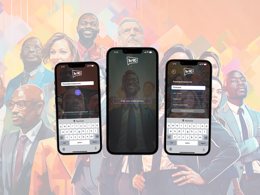
1. UI/UX Design: A complete redesign of the authentication flow and user interface, focusing on making the app easy to navigate, particularly for older adults. This included the creation of user personas, user flows, and mock-ups to improve the patient journey through the app.
2. Accessibility and Usability: Given that the primary demographic was older adults (65+), the team prioritized accessibility features such as screen reader compatibility, adjustable font sizes, and color contrast adjustments.
3. Compliance: Since the app handled sensitive medical data, it was designed to be HIPAA-compliant, with a focus on data privacy and security.
4. Dynamic Logic in Forms: The app included up to 73 pre-screening questions, designed with dynamic logic to guide patients through necessary steps while simplifying the process where possible.
Approach and Methodology
The one-week sprint approach transformed into an extended project, reflecting the complexity of developing a healthtech solution. The project combined multiple methodologies, including:
1. AI-Aided Research: The team utilized AI tools to perform a competitive audit, comparing Be MRI Safe with similar medtech products in the market. This provided valuable insights into industry standards and helped identify gaps and opportunities.
2. Stakeholder Interviews: Brady UX conducted interviews with stakeholders from Healthier Forms and other stakeholders to gather insights about patient pain points, operational inefficiencies, and regulatory requirements.
3. User Testing: The app was tested with older adults, simulating MRI pre-screening tasks to evaluate ease of navigation, clarity of instructions, and overall user comfort. Feedback from this testing highlighted areas needing improvement, such as hidden buttons and text readability.
Outcomes and Deliverables
By the end of the project, the Be MRI Safe team delivered the following key components:
1. Research Reports: Comprehensive findings from competitive audits and stakeholder interviews that shaped the design strategy.
2. Redesigned User Interface: A clean, intuitive authentication flow and a more accessible interface tailored to older adults.
3. User Personas and User Flows: Developed personas and flow diagrams to ensure the app catered to both tech-savvy and less tech-literate users.
4. Design Roadmap: A detailed roadmap provided Healthier Forms with a clear guide on next steps, from Phase Two integrations with Epic to scalability for other healthcare services.
5. Test Results: While initial user testing provided only partial results, it demonstrated the app's potential to improve MRI screening processes, with positive feedback on usability from the client.
Client Feedback and Reflections
The client praised the delivered UI/UX designs and research, noting that the clean, redesigned user flow significantly improved the app's functionality. However, due to a lack of immediate funding, the client was unable to move forward with full-scale development at that time. Despite this, the groundwork laid by Brady UX placed Be MRI Safe in a strong position for future funding efforts.
From the team's perspective, this project led to a rethinking of how Design Alchemy should approach future opportunities. Two new strategies emerged: offering an affordable package that includes research, design, and a pitch deck for unfunded founders, and providing simple clickable prototypes at a lower price point to attract early-stage entrepreneurs. These strategies reflect the lessons learned from balancing pro bono work with sustainability.
Conclusion
The Be MRI Safe case illustrates how Brady UX adapted a pro bono initiative into a valuable medtech project, delivering a comprehensive design package that balanced accessibility, usability, and compliance. Although the project highlighted the financial challenges that often accompany early-stage healthcare innovations, it ultimately positioned the client for future success while reshaping Brady UX’s approach to offering services to startups.
